A Fresh Take on Tradition
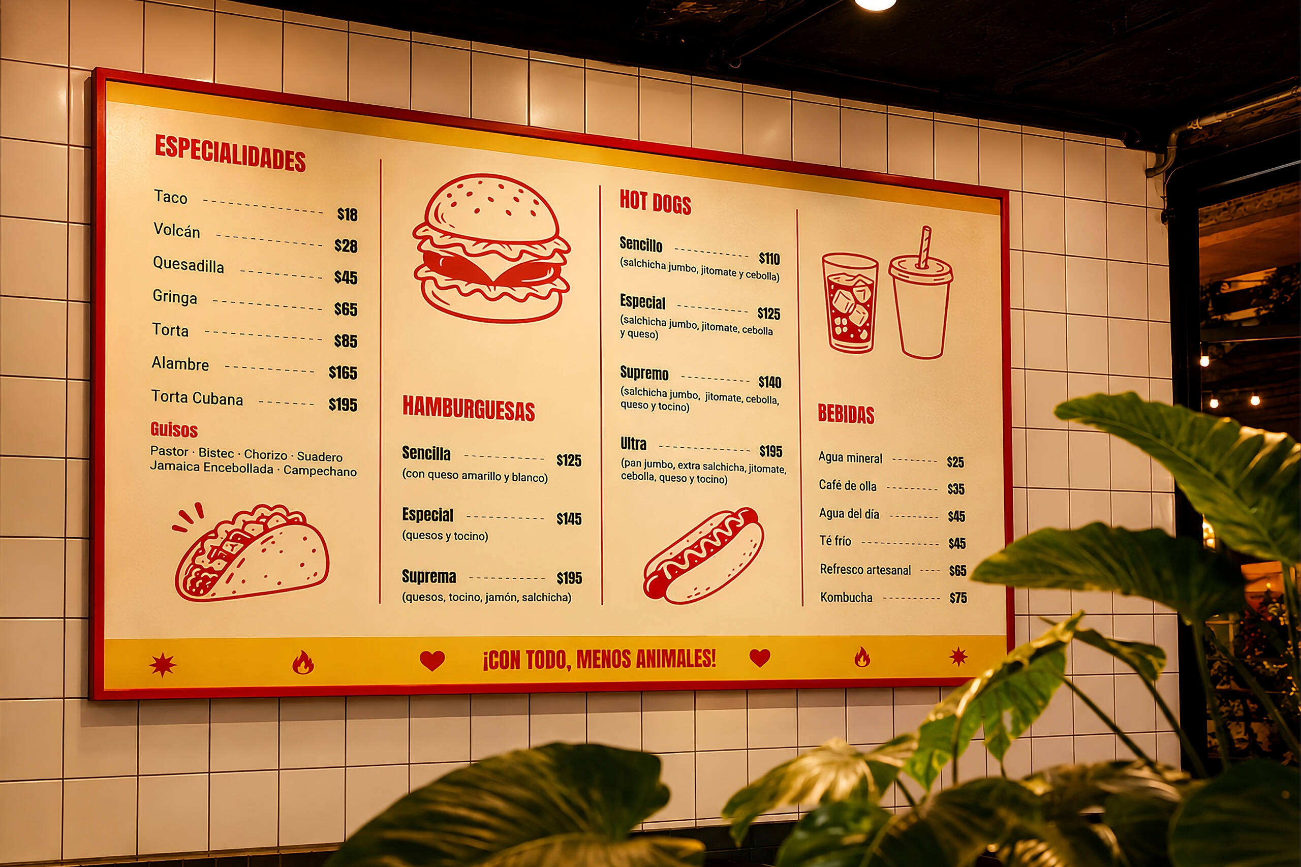
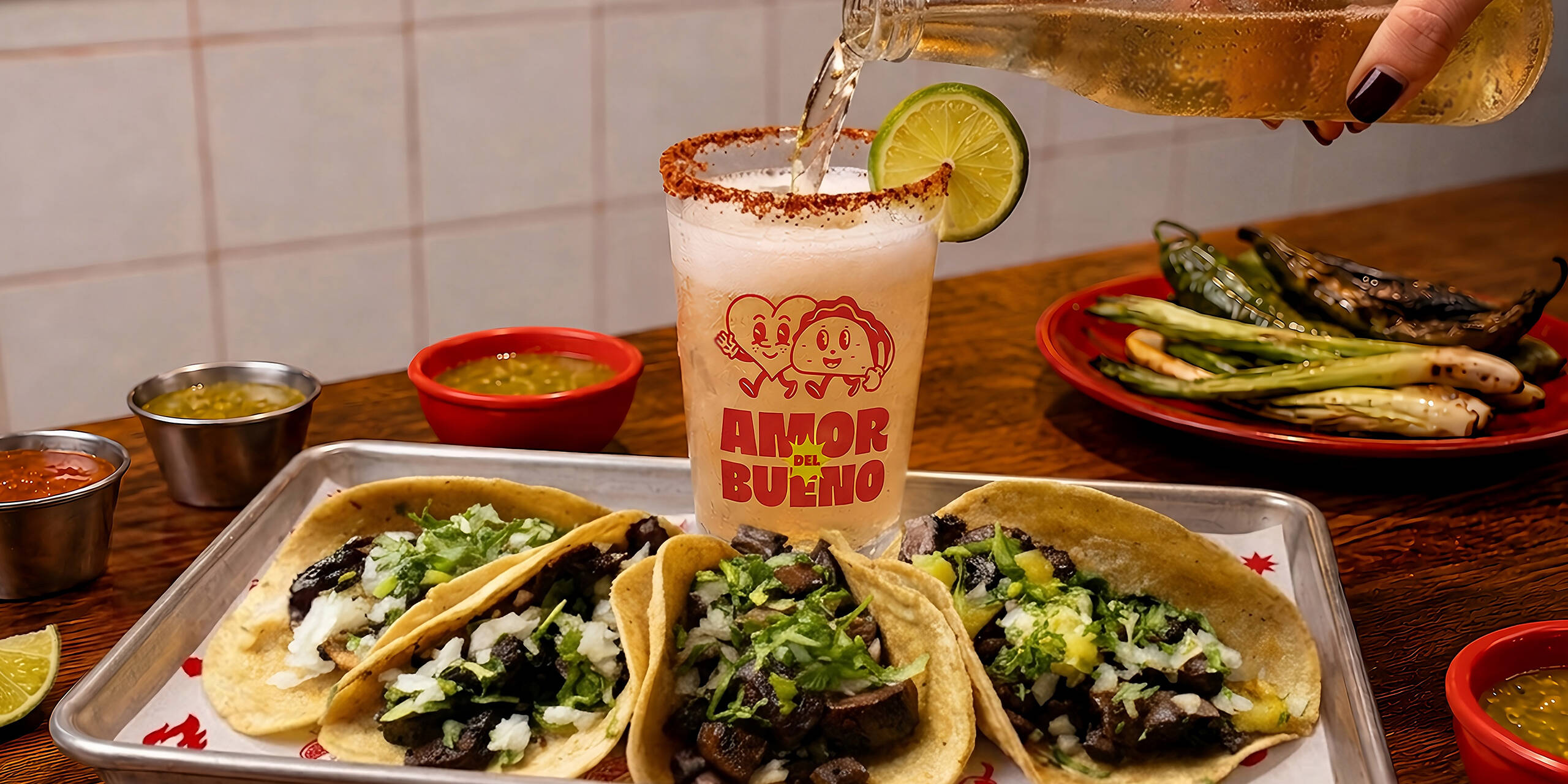
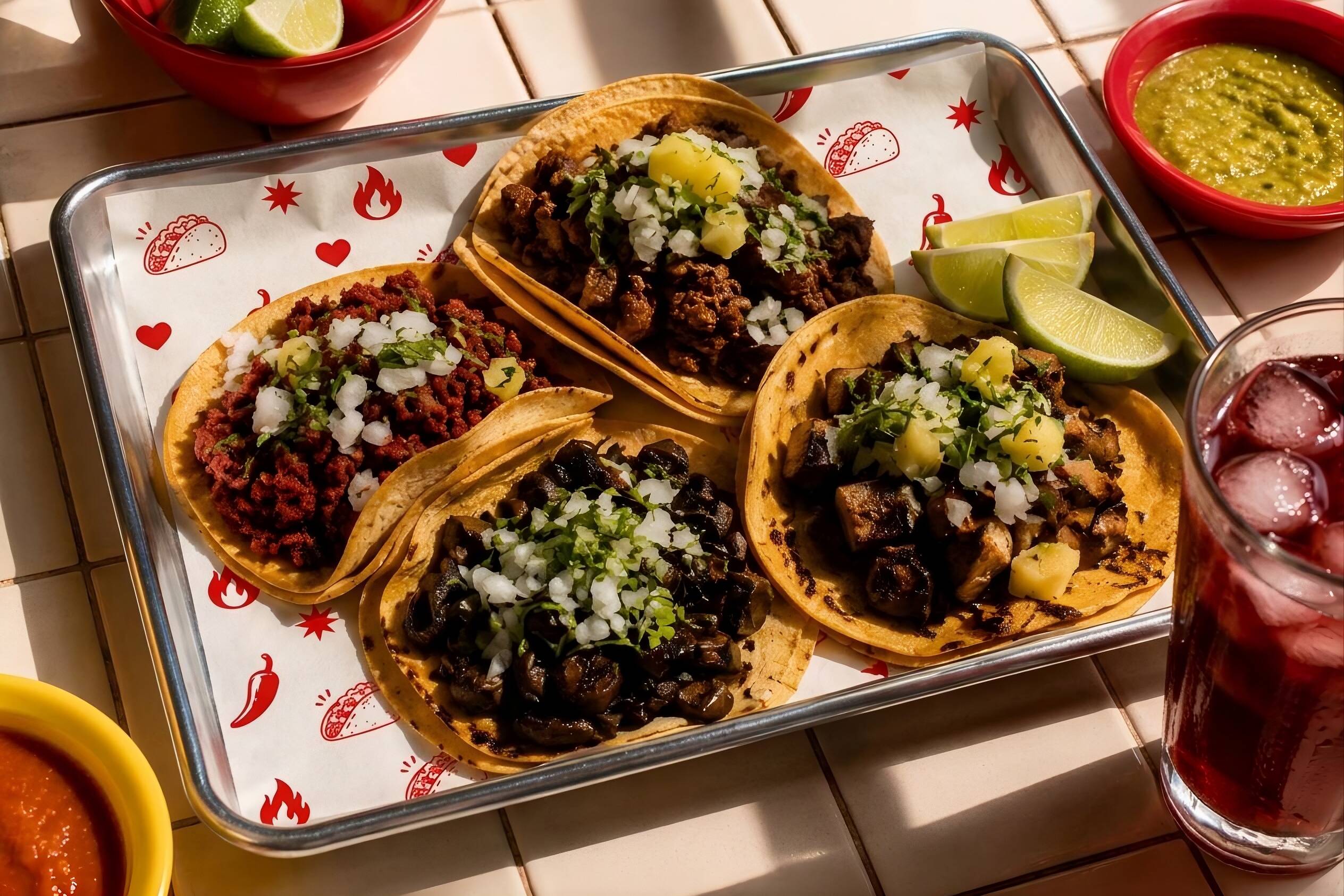
The identity was built around a simple idea: plant-based food should feel just as familiar, satisfying, and approachable as the taquerías people already know and love. Food photography, playful messaging, and a warm visual language place the experience of eating first, allowing the brand’s values to come through naturally

Made with Character
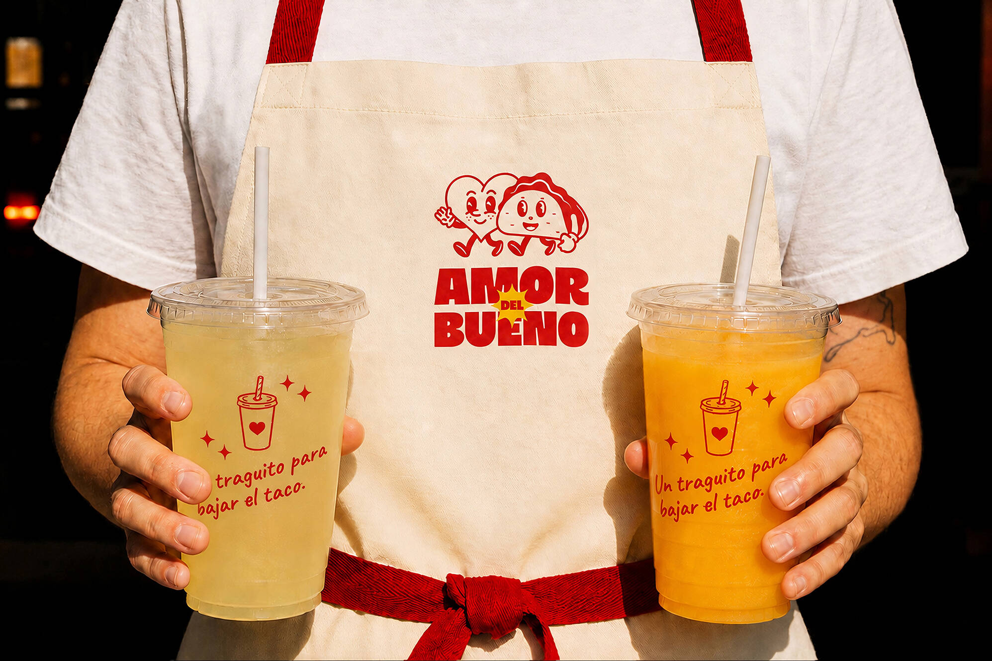
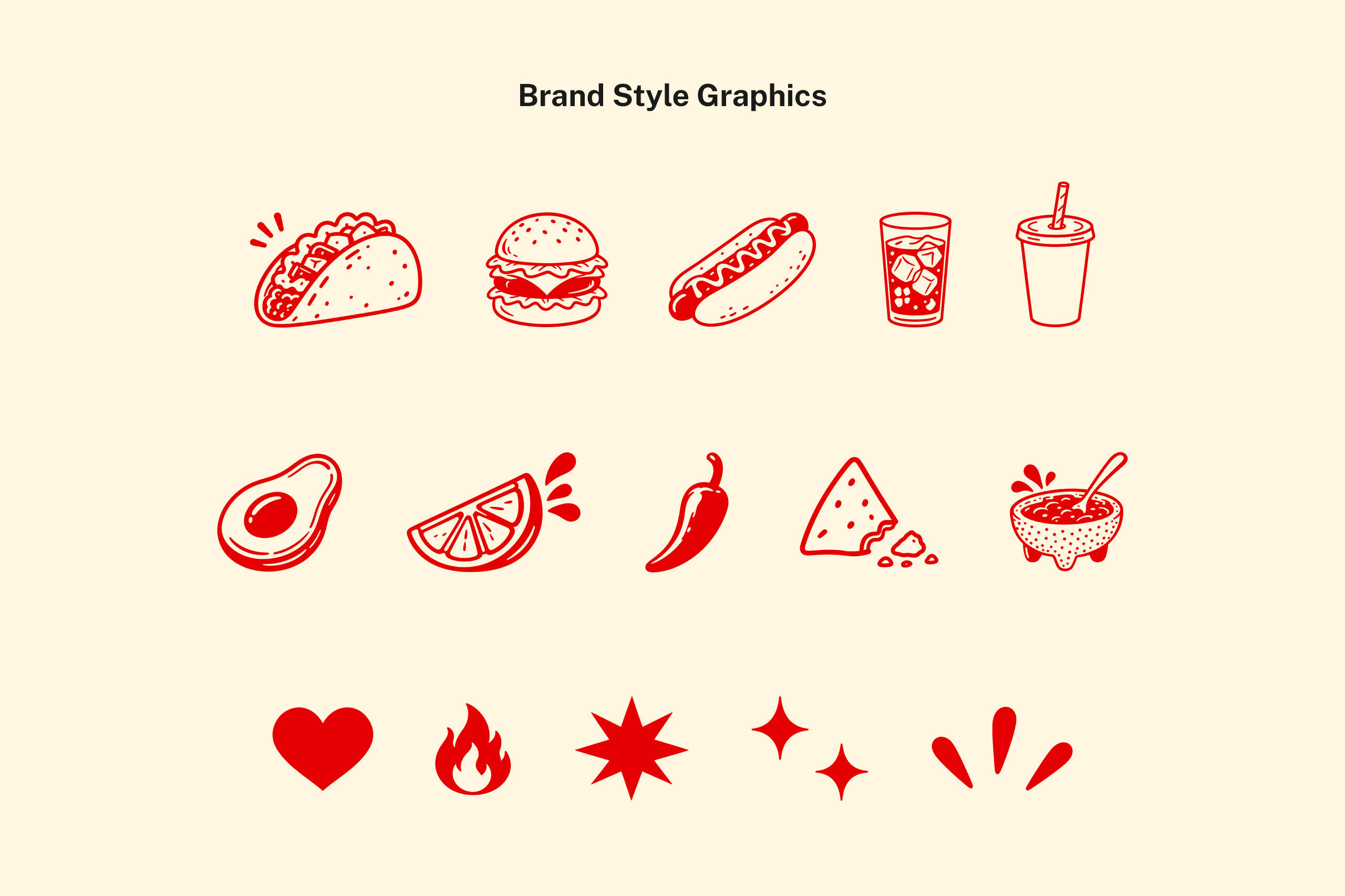
A new logo, vibrant color palette, illustration system, typography, and conversational tone came together to give Amor del Bueno a recognizable personality. Inspired by the visual energy of traditional Mexican food culture, the system balances humor, warmth, and boldness while keeping the brand’s plant-based philosophy present without making it feel restrictive.
Pantone® 2347 C
C3 M100 Y100 K0
R228 G0 C0
#E40000
Pantone® Yellow C
C4 M8 Y100 K0
R252 G220 C0
#FCDC00
Pantone® 3522C
C100 M18 Y100 K7
R0 G135 C52
#008734
Pantone® 1495 C
C0 M53 Y95 K0
R255 G146 B25
#FF9219
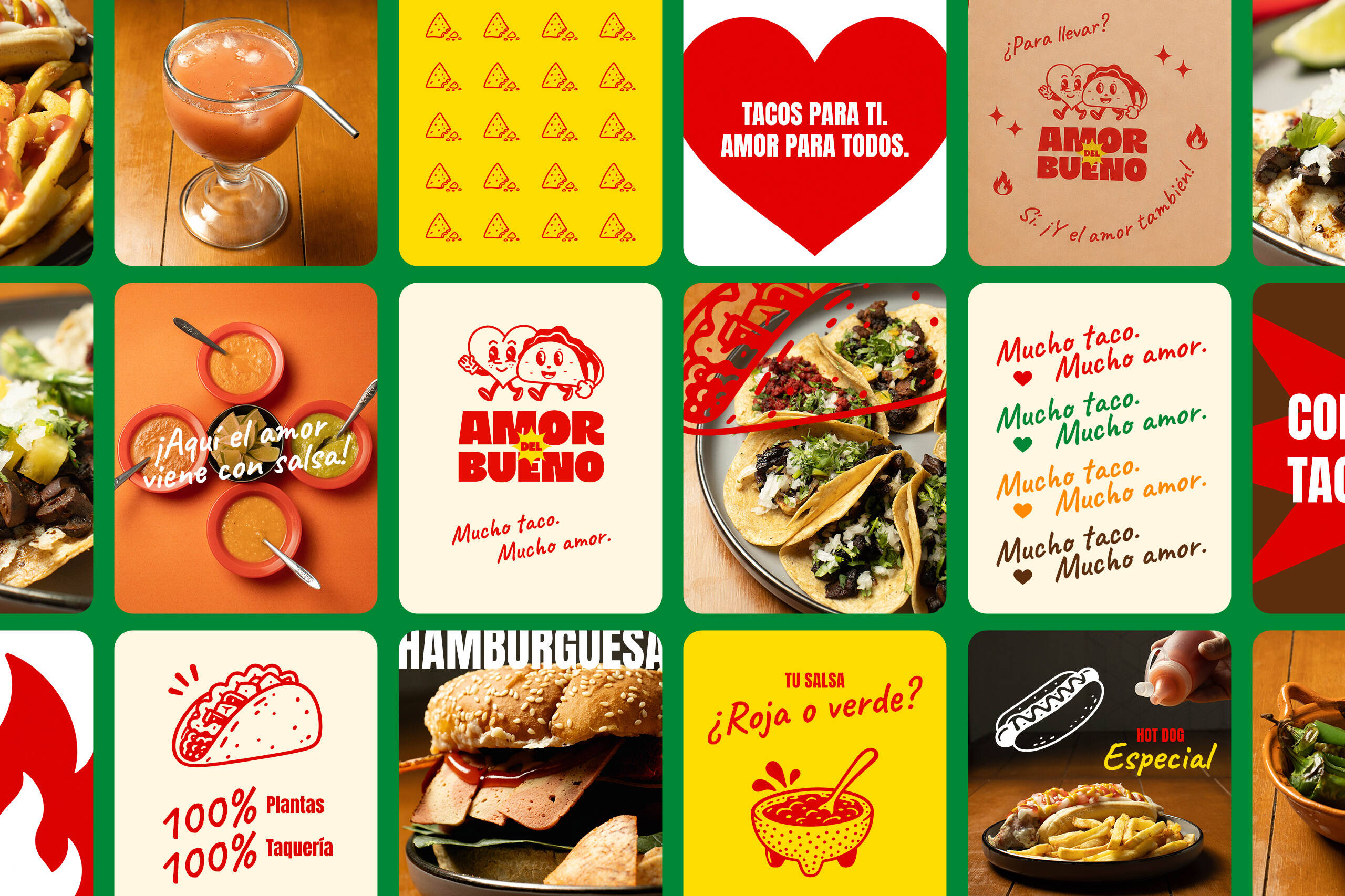
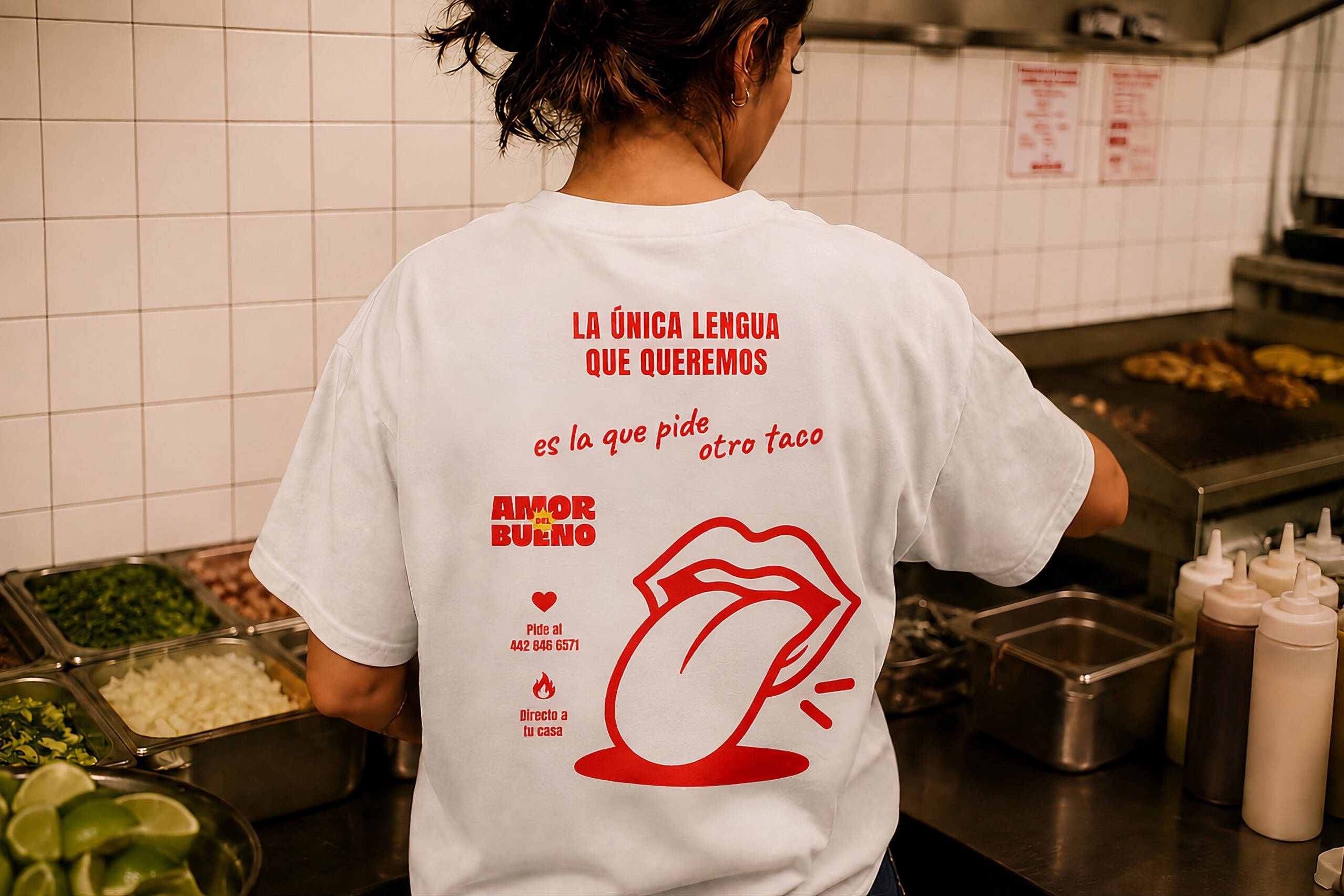
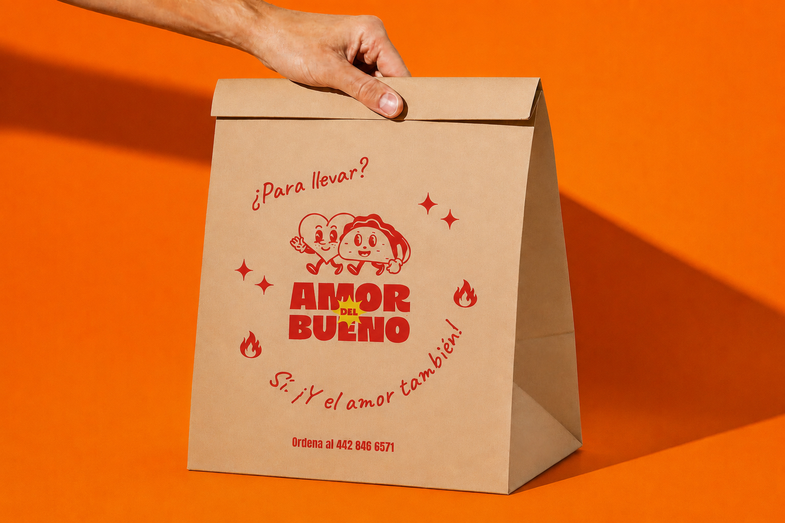
The identity was designed to live naturally across every part of the taquería, from menus and uniforms to cups, packaging, signage, and social content. Consistent graphics and playful copy turn everyday touchpoints into part of the experience, creating a brand that feels cohesive, memorable, and distinctly Amor del Bueno.