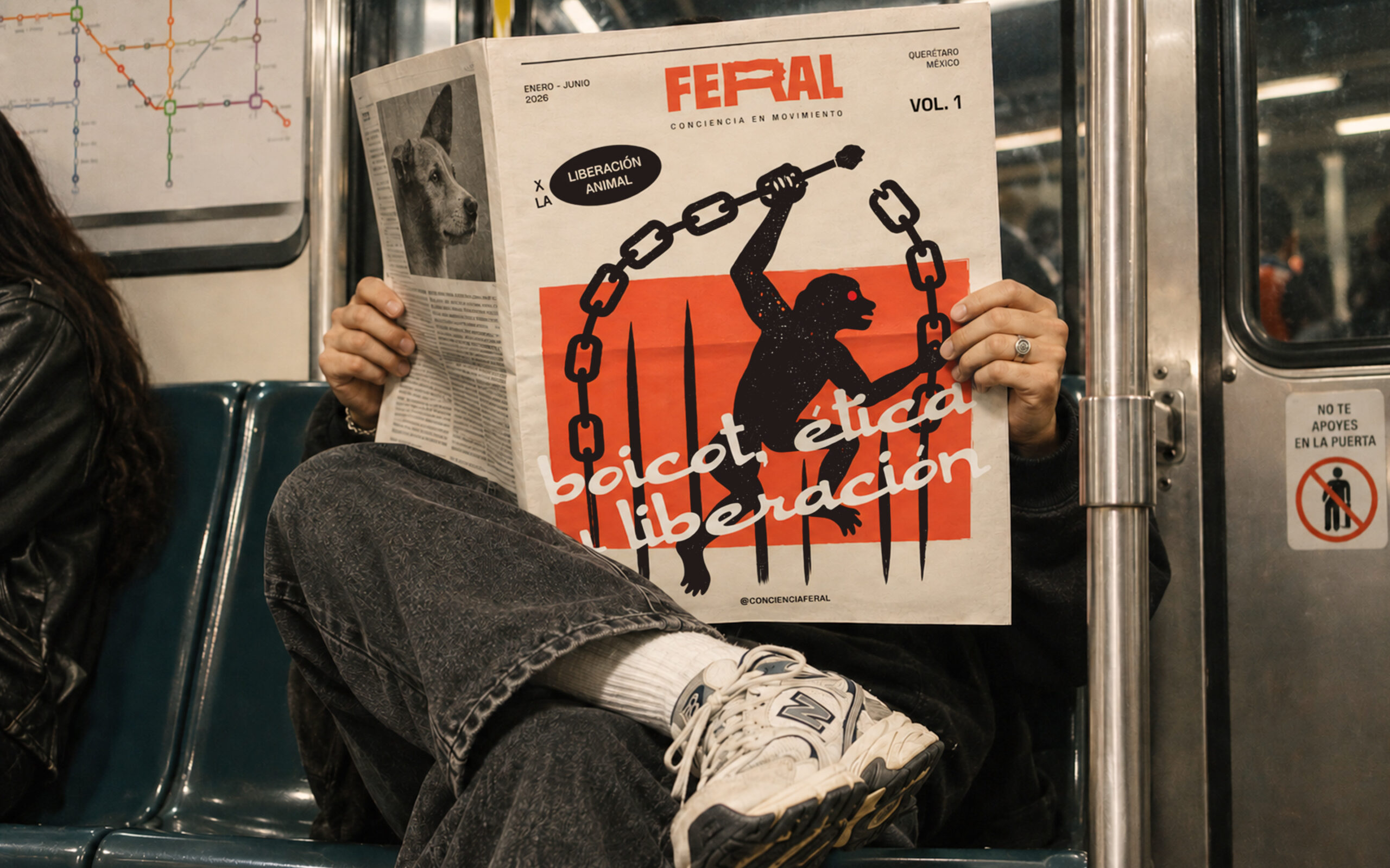
No Shortcuts
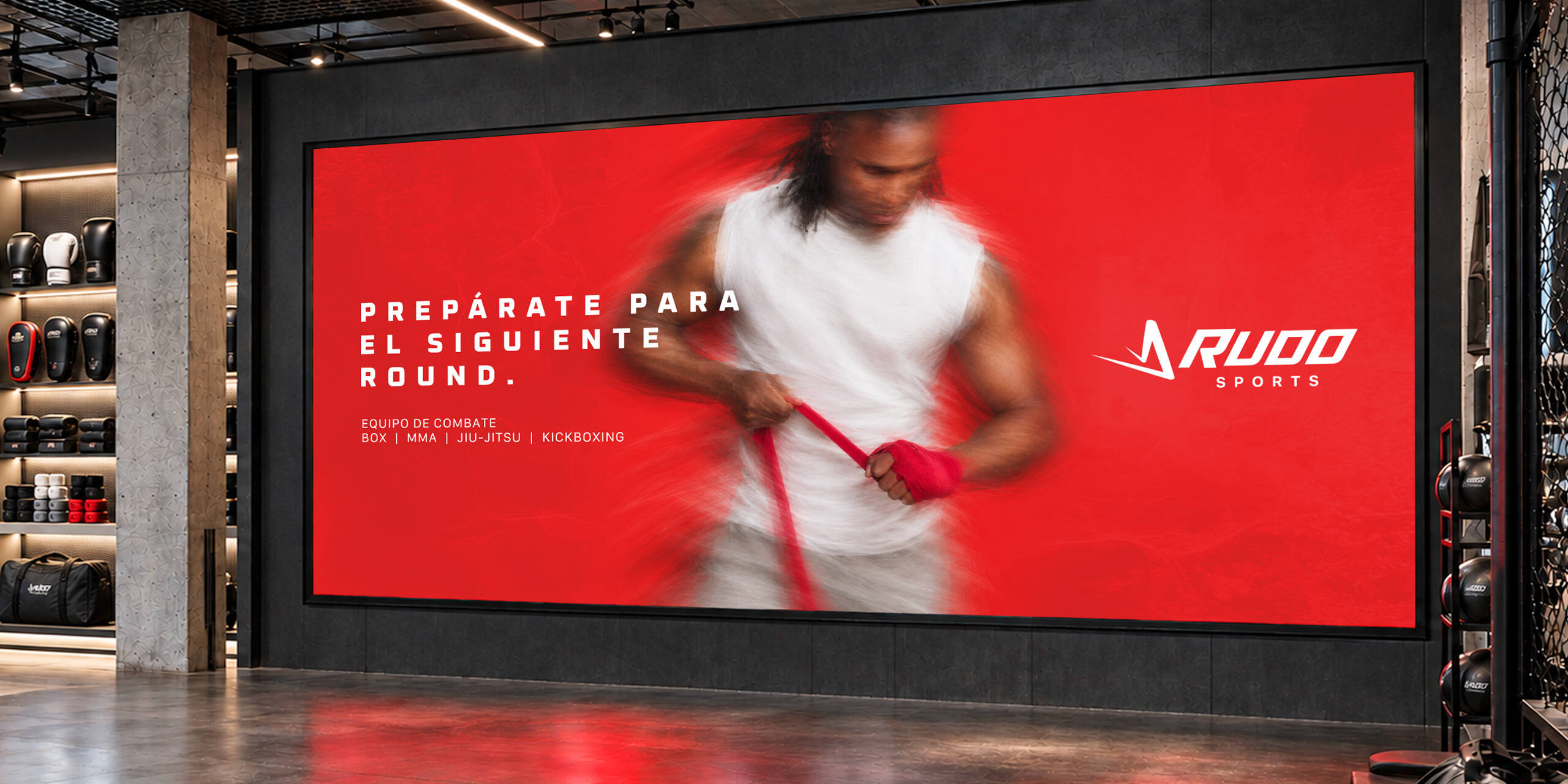
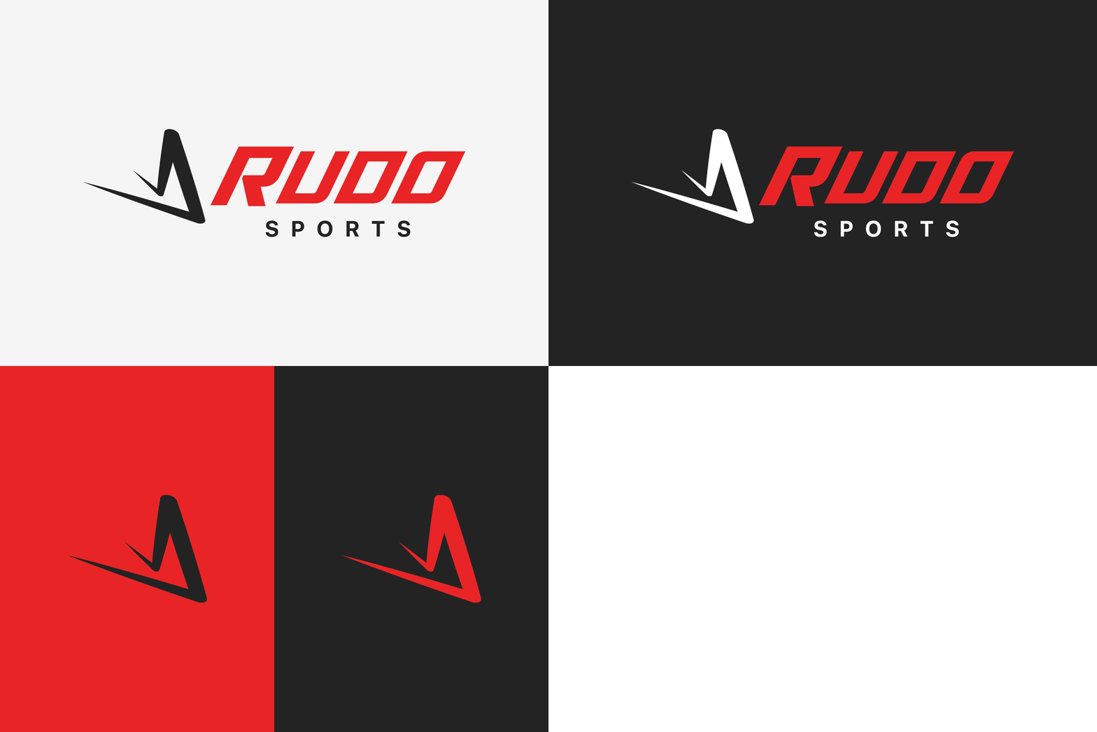
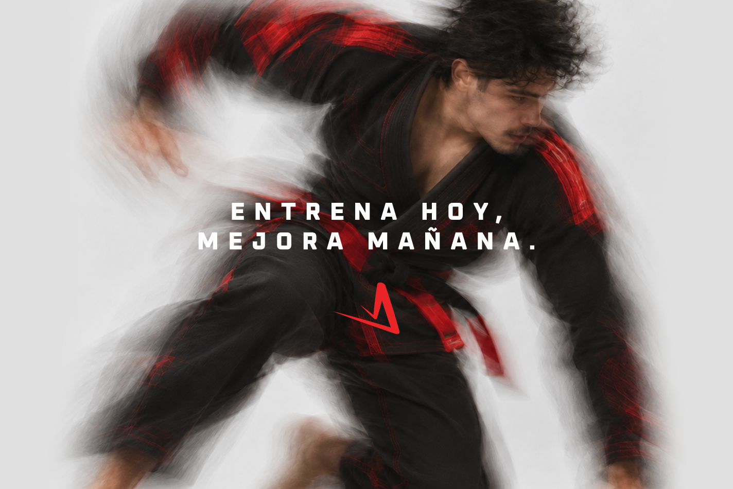
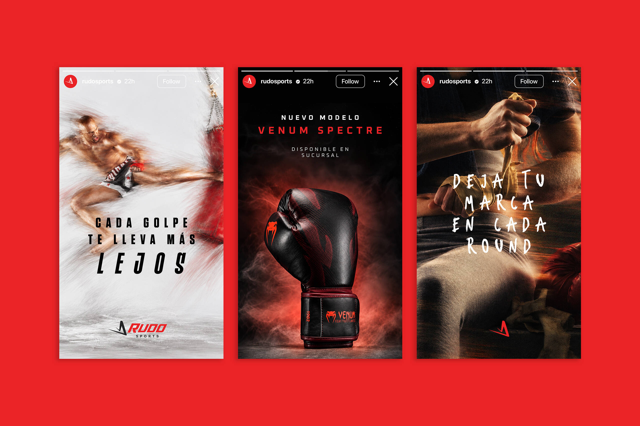
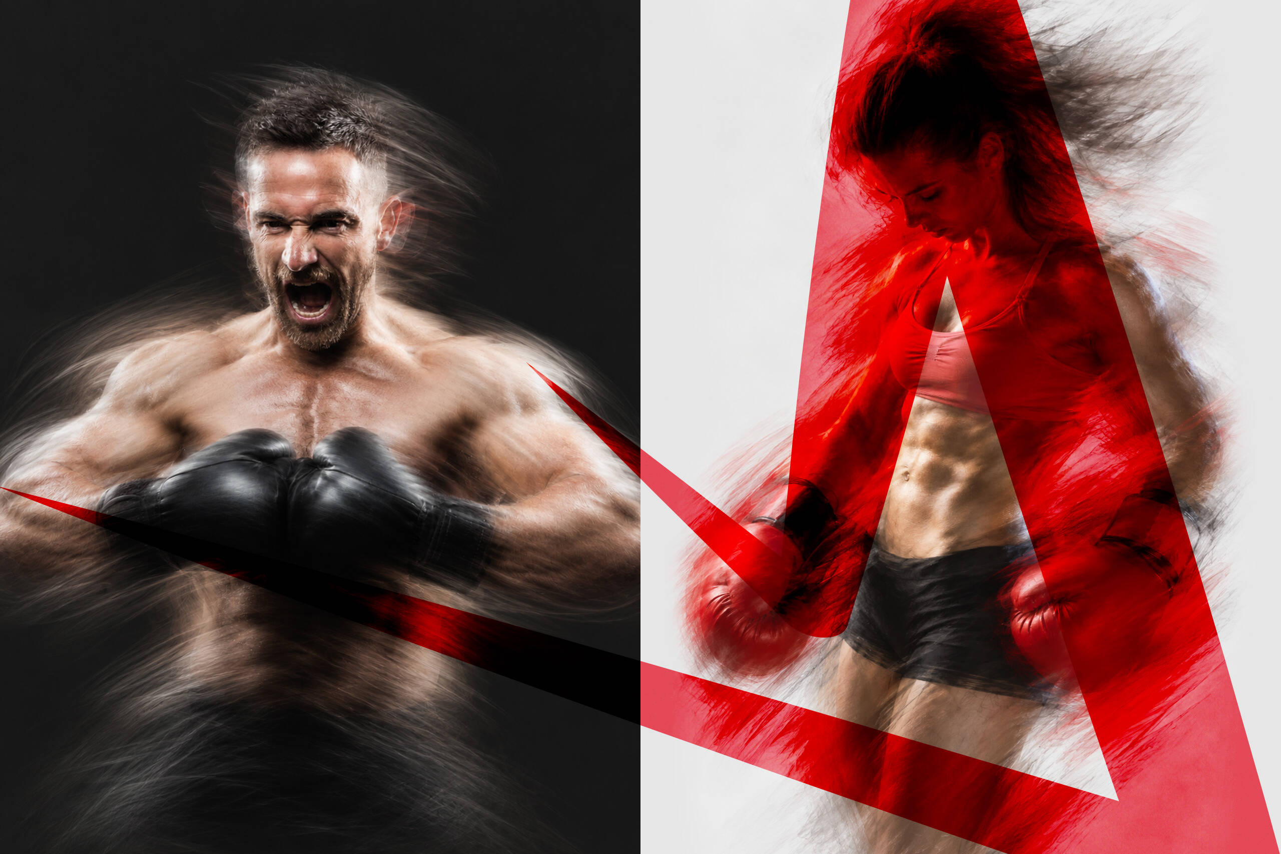
The name Rudo was chosen to communicate strength, determination, and resilience in a way that feels relevant to both men and women. The visual identity builds on that idea through bold typography, sharp forms, high contrast, and motion-driven imagery that reflects the intensity and discipline of training.
Every Round Counts
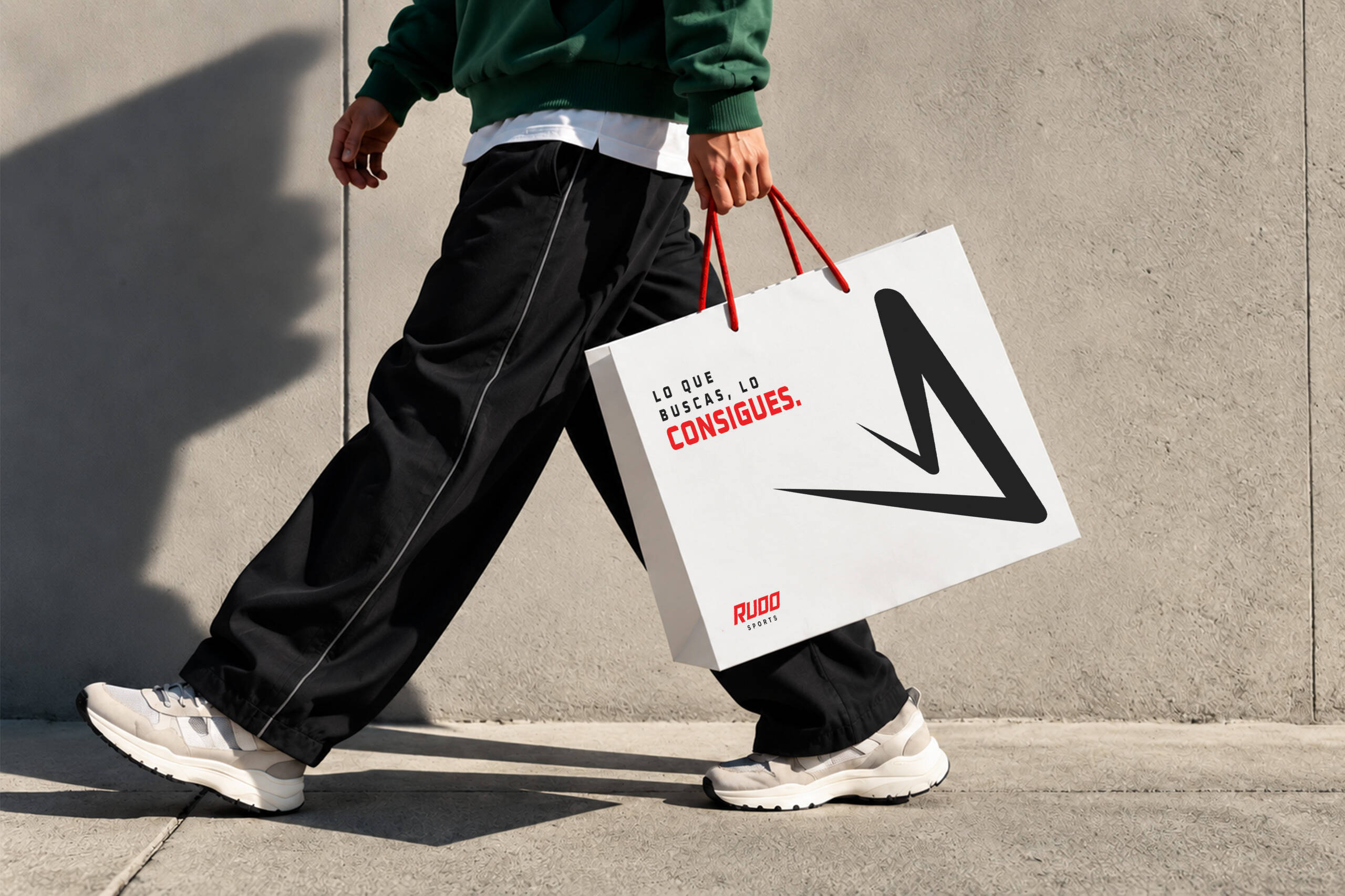
The identity was designed to remain consistent across packaging, campaigns, social media, and promotional content. Red, black, and white create a recognizable foundation, while dynamic photography, movement effects, and direct messaging give the brand a strong and energetic personality.
Carbon Black
C72 M66 Y64 K71
R35 G35 B36
#232324
Strong Red
C2 M98 Y97 K0
R233 G35 B38
#E92326
Dusty Gray
C15 M11 Y12 K0
R214 G214 B214
#D6D6D6
White Smoke
C3 M2 Y2 K0
R245 G245 B245
#F5F5F5
Gear Up
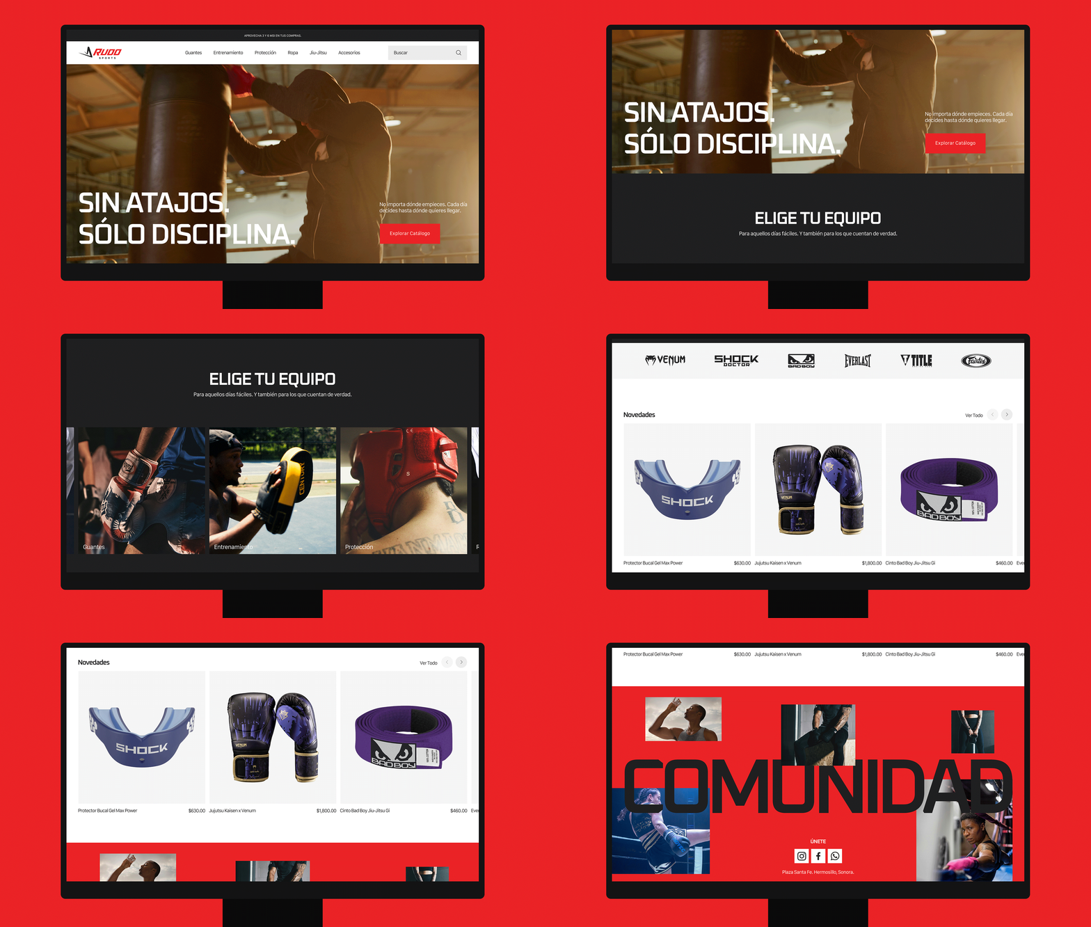
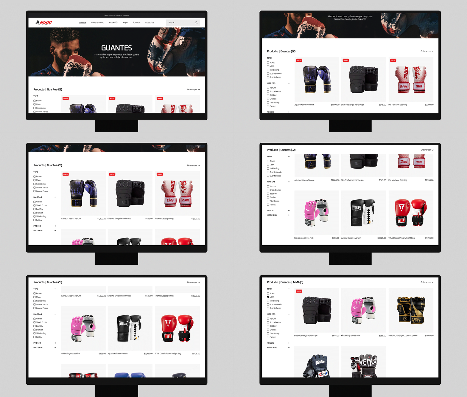
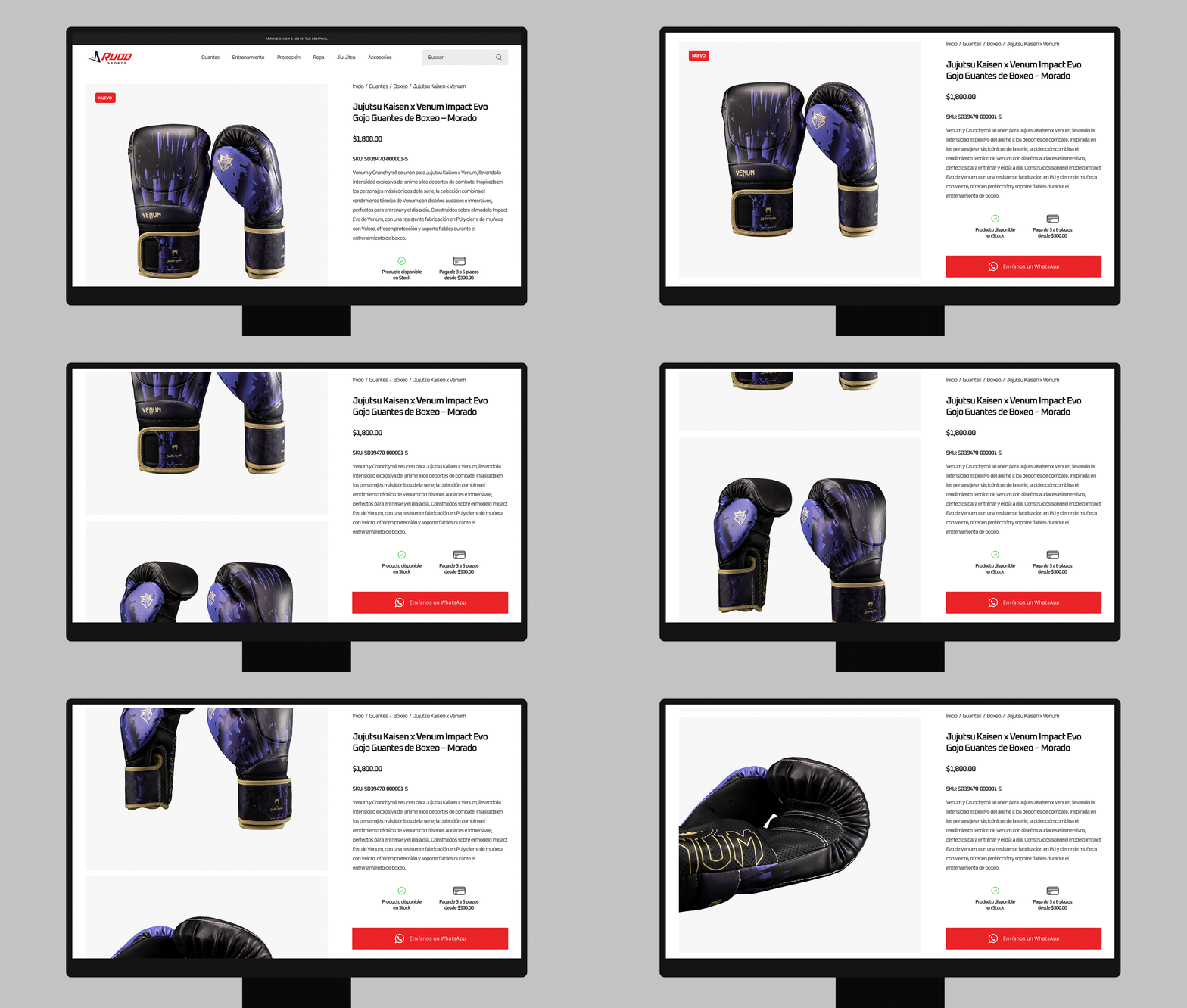
The website translates the same visual language into a clear, product-focused experience. Rather than functioning as an ecommerce platform, it works as an informative catalog where users can explore categories, discover available products, and understand the range of combat sports supported by the brand.