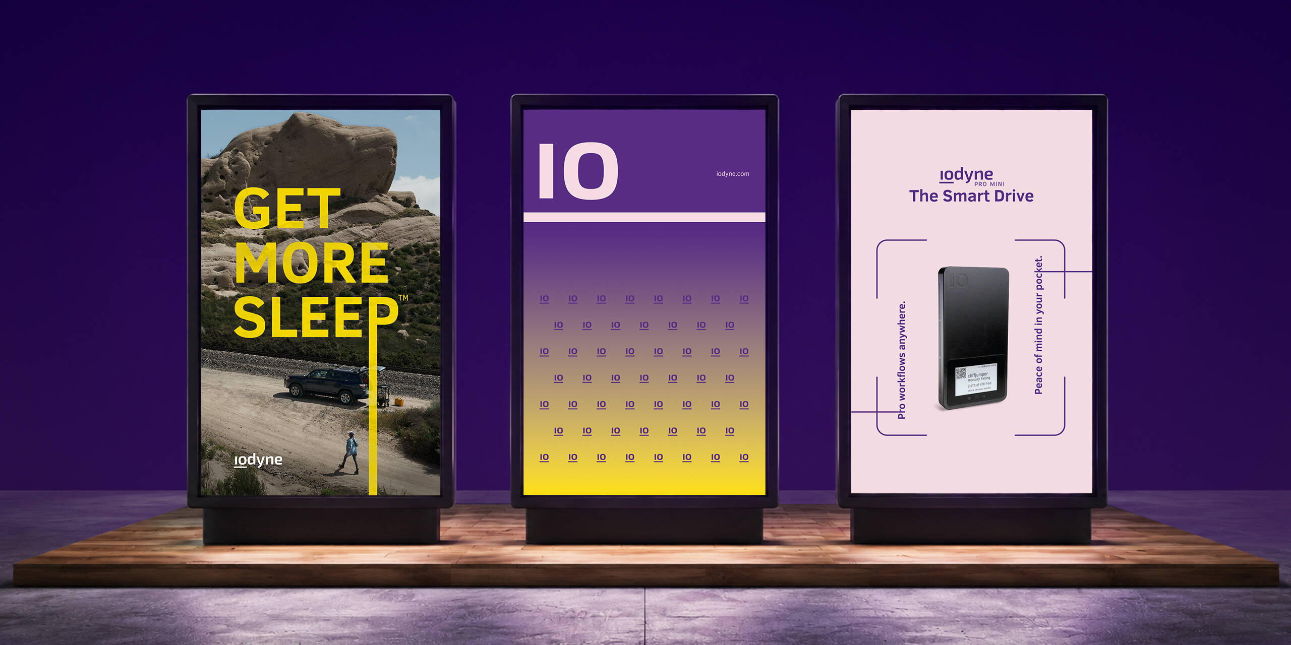
Humanizing Performance
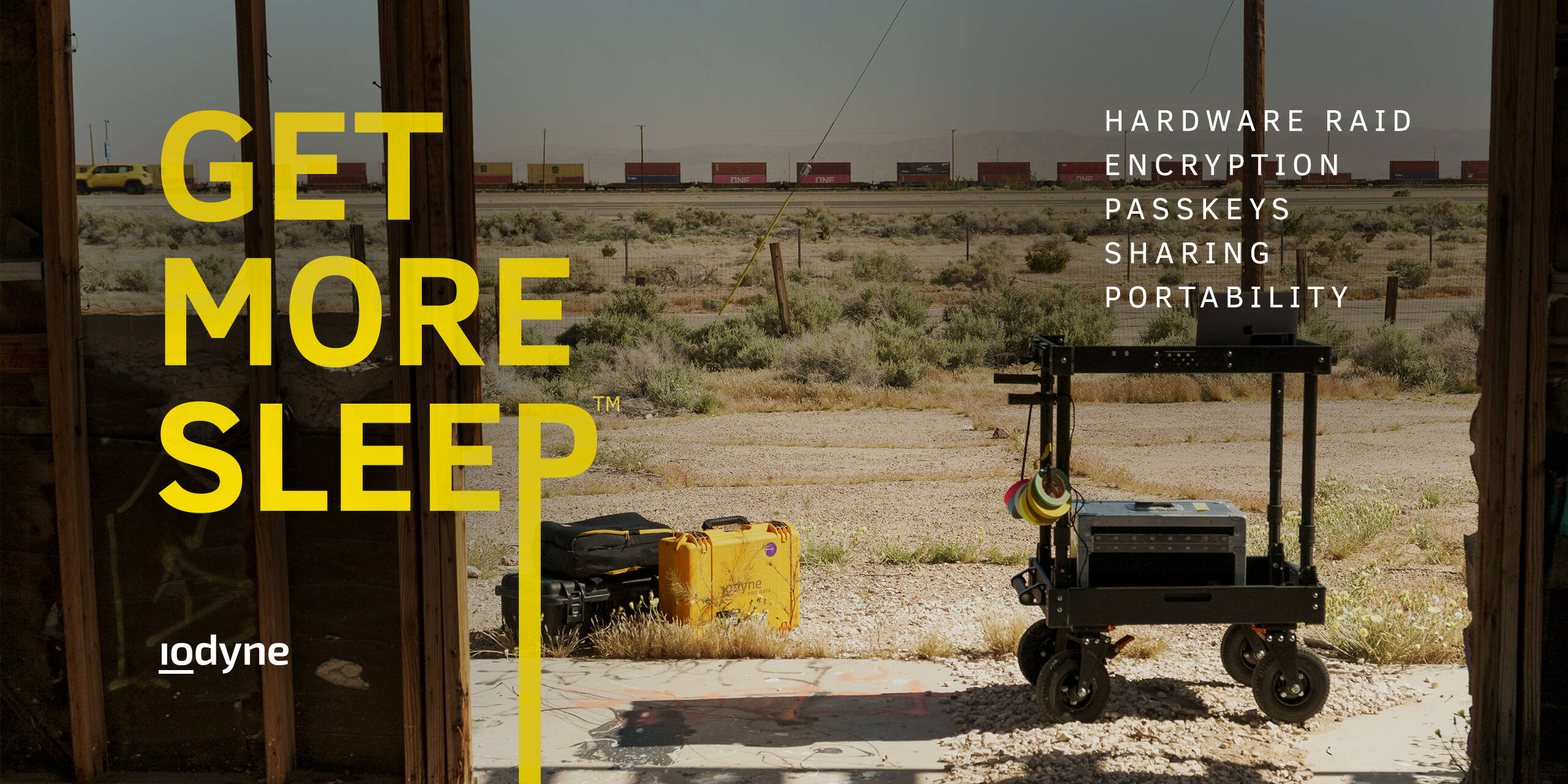
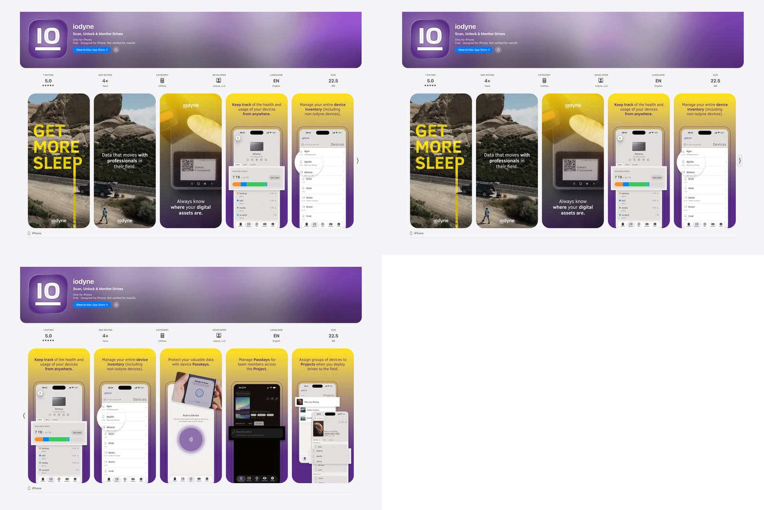
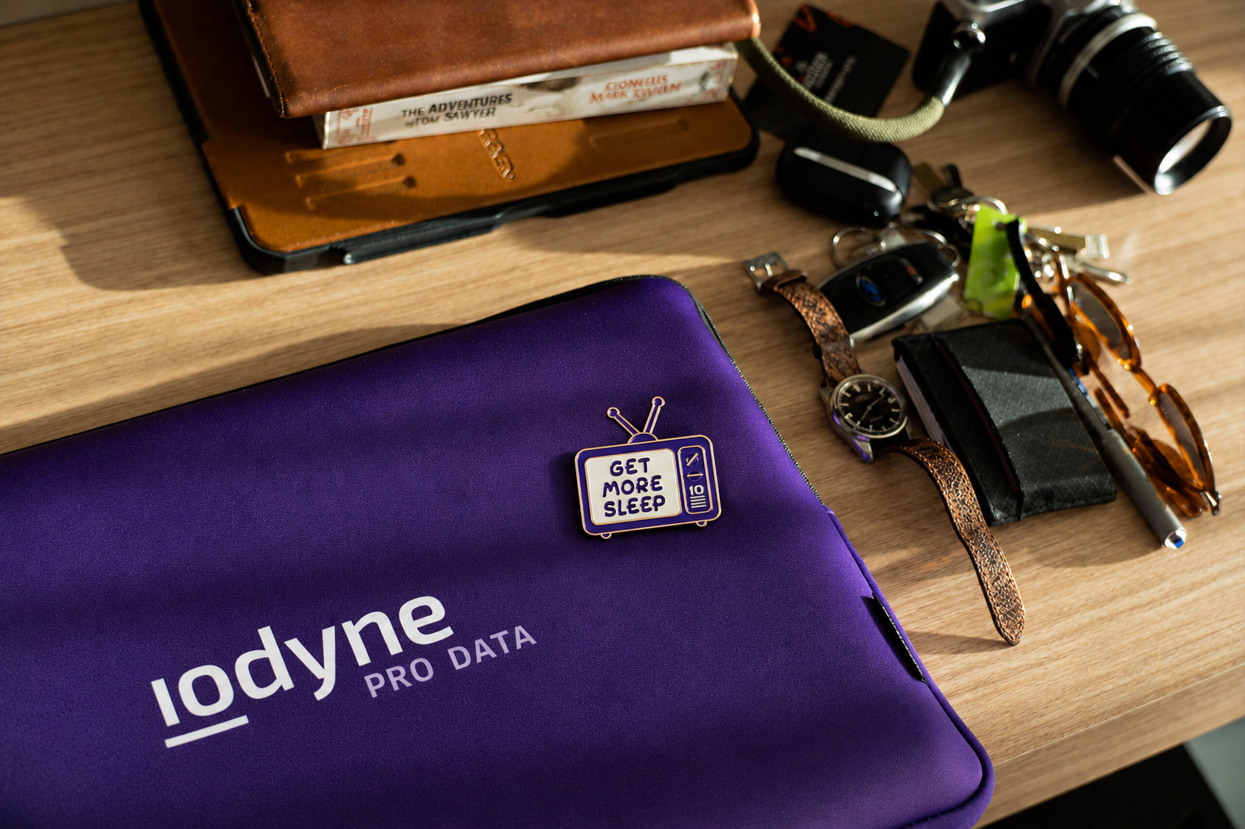
The work centered on translating iodyne’s technical capabilities into a visual language that felt immediate, confident, and approachable. Concepts such as “Get more sleep” turned speed, security, and smarter workflows into a simple human benefit: less time managing data, more time away from the workstation.
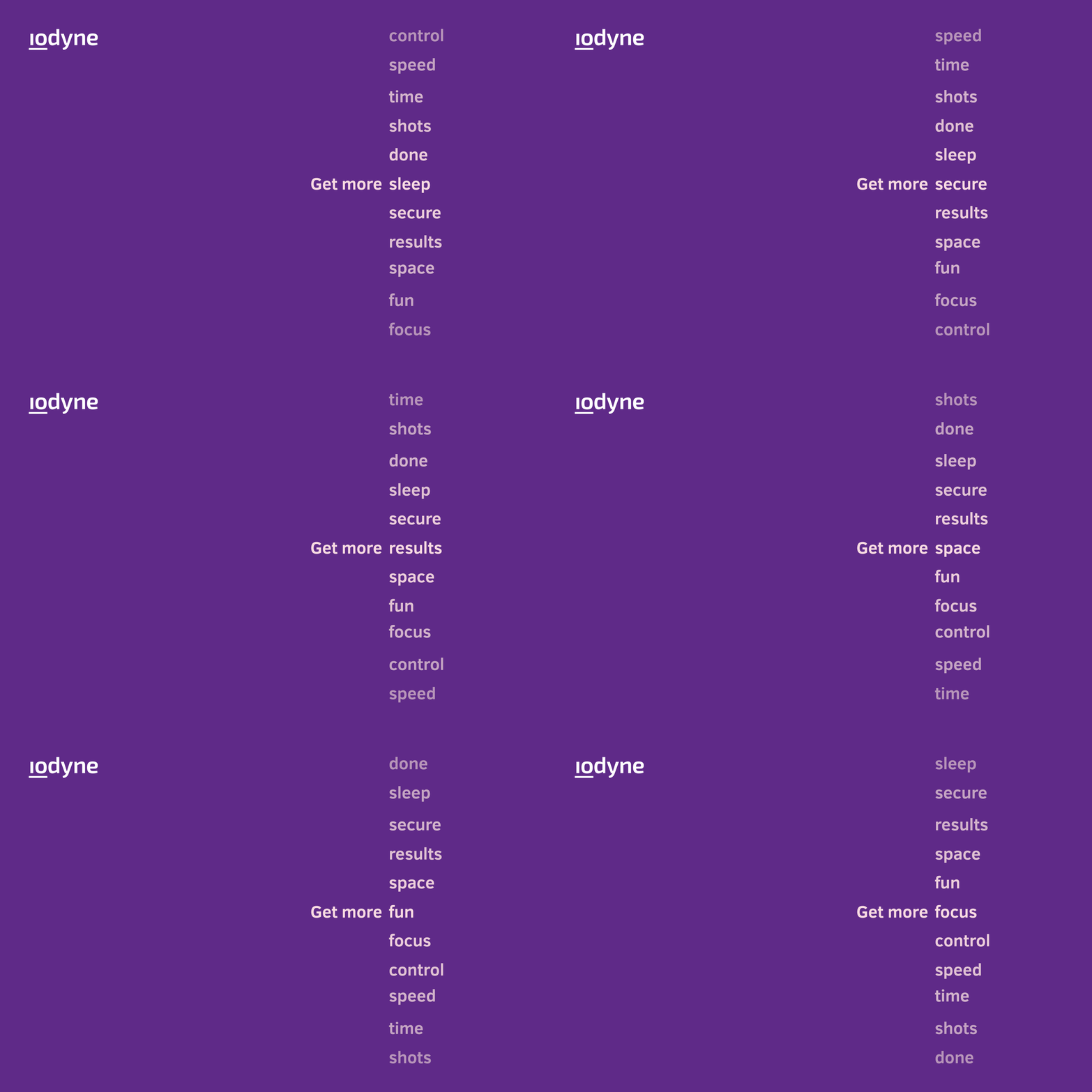
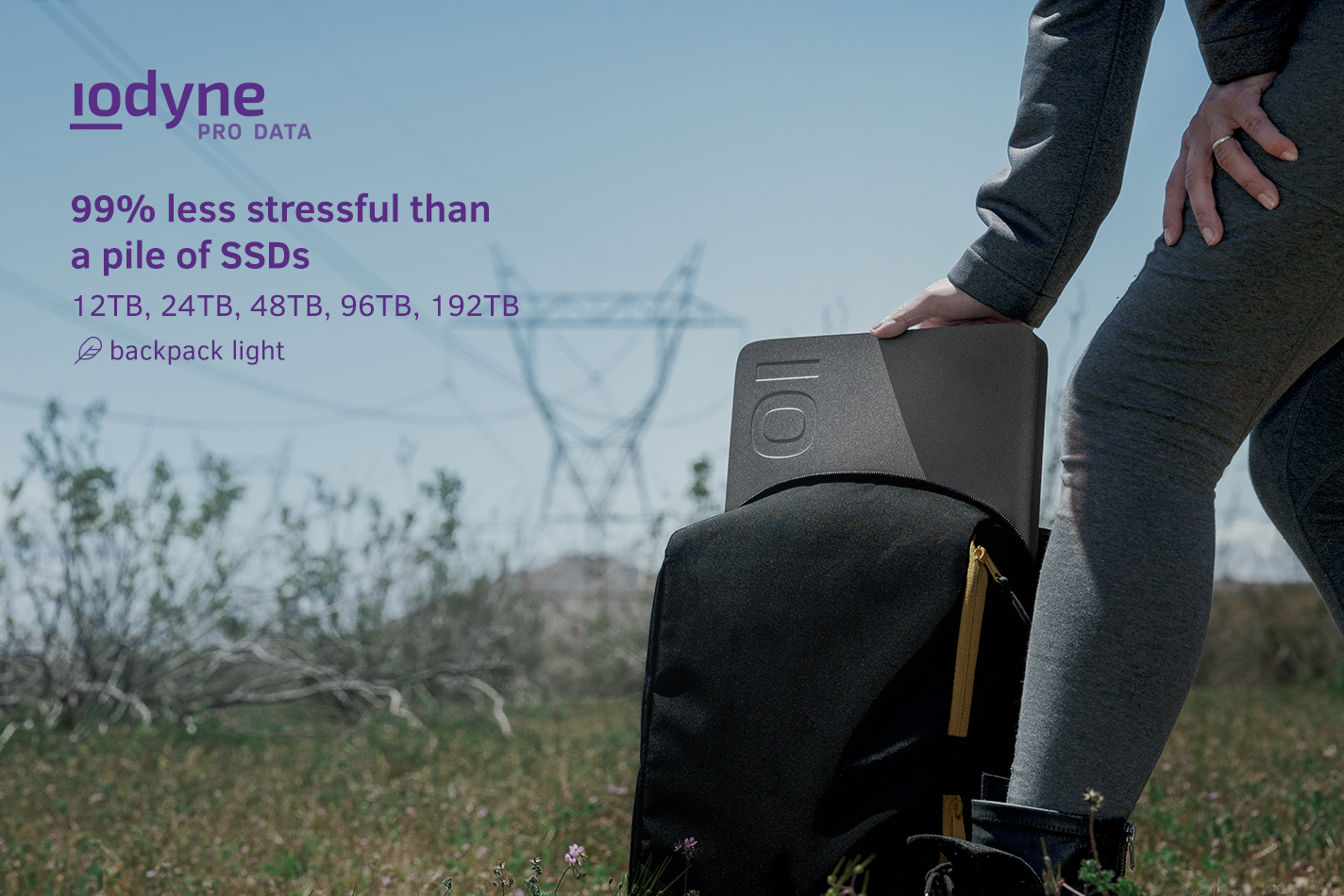
Flexible by Design
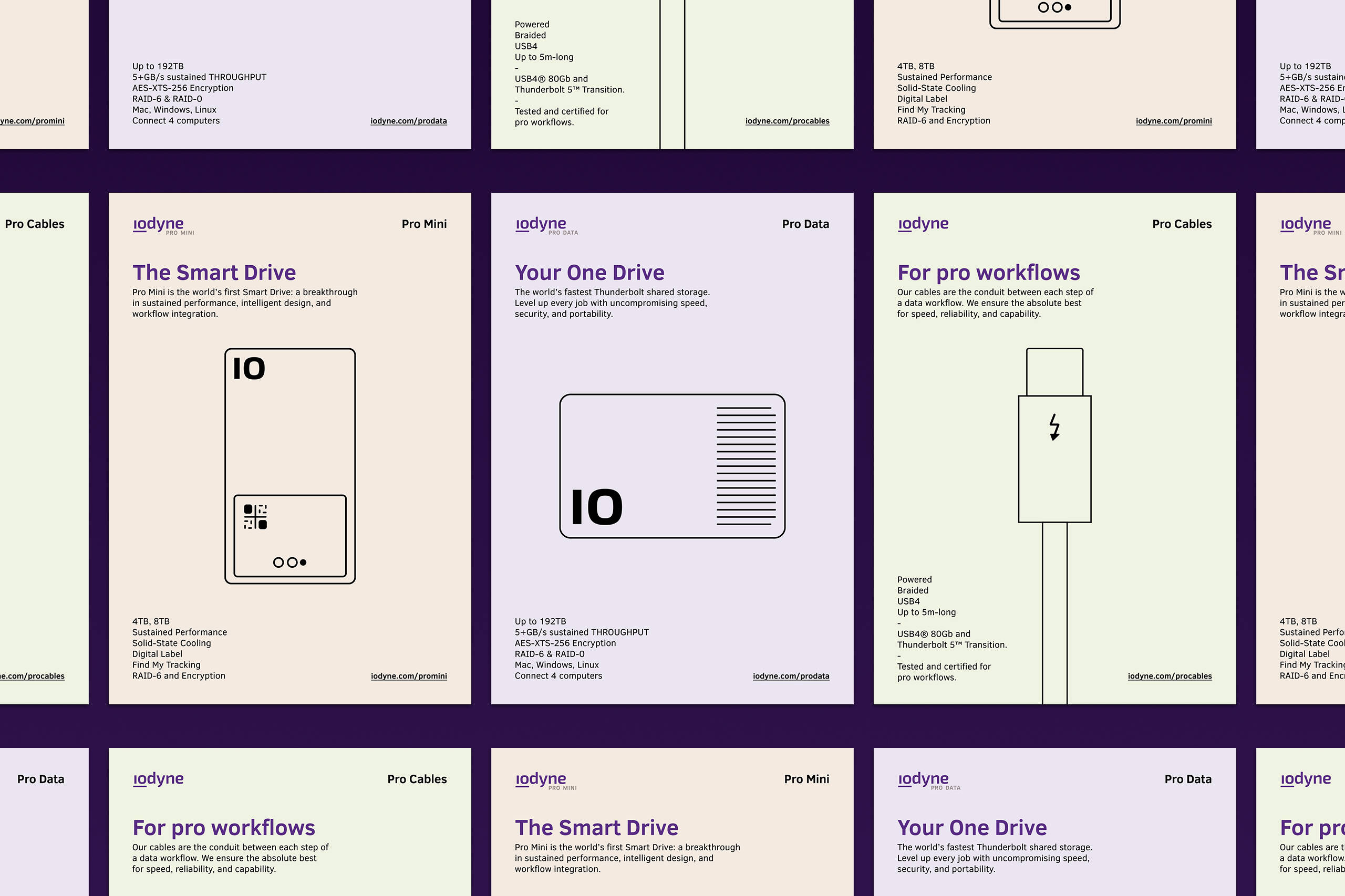
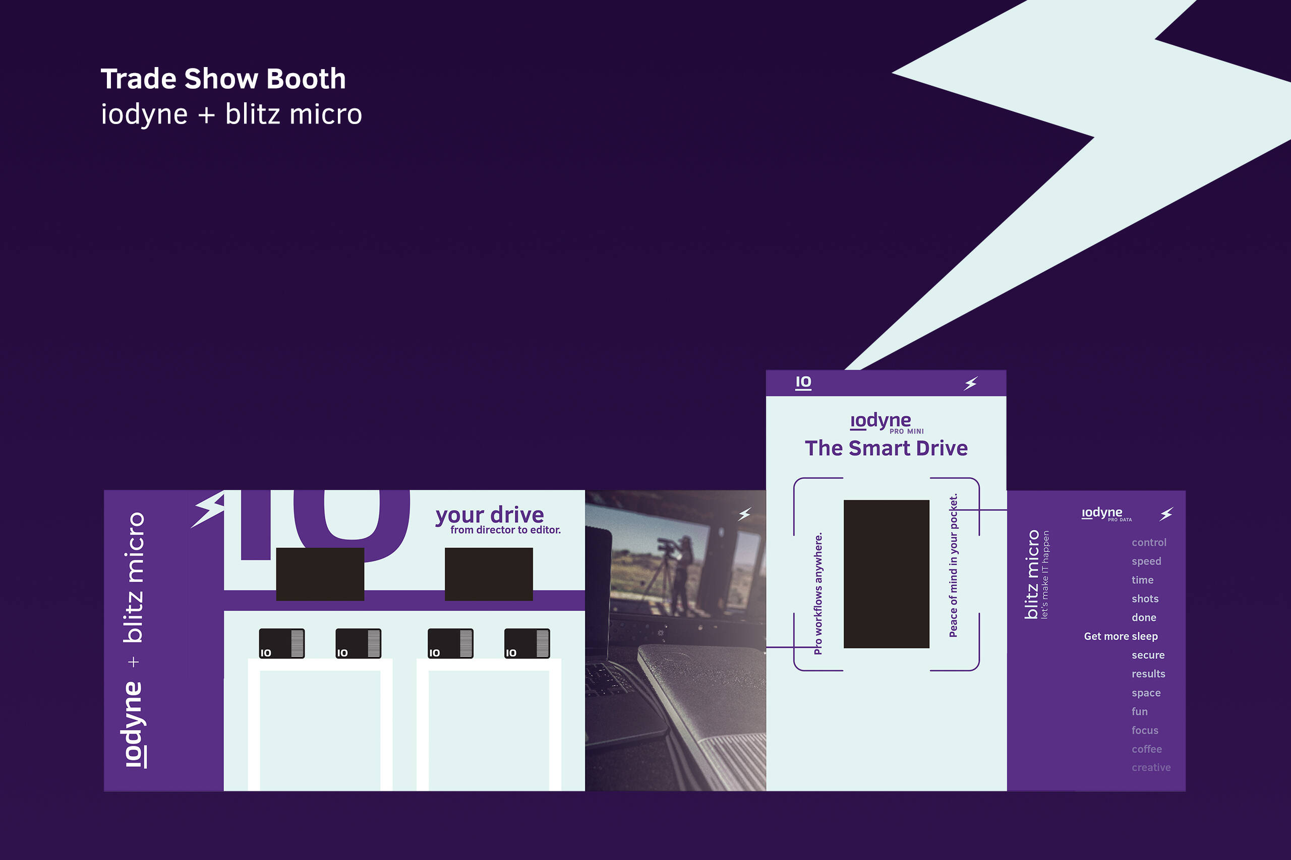
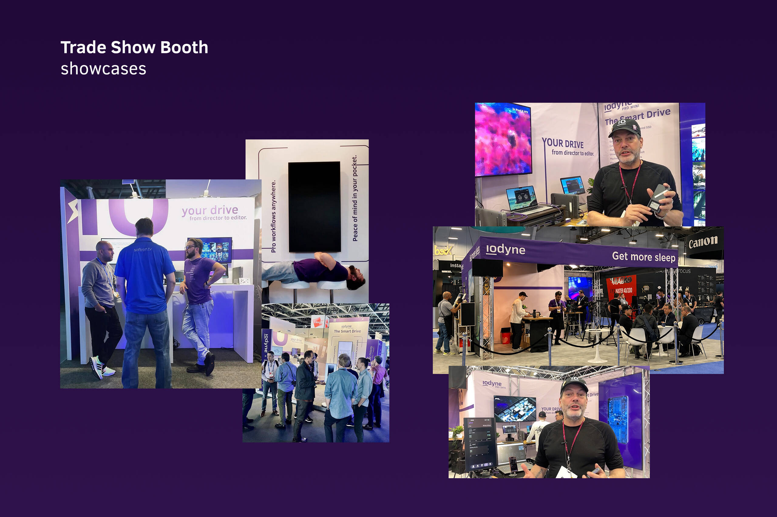
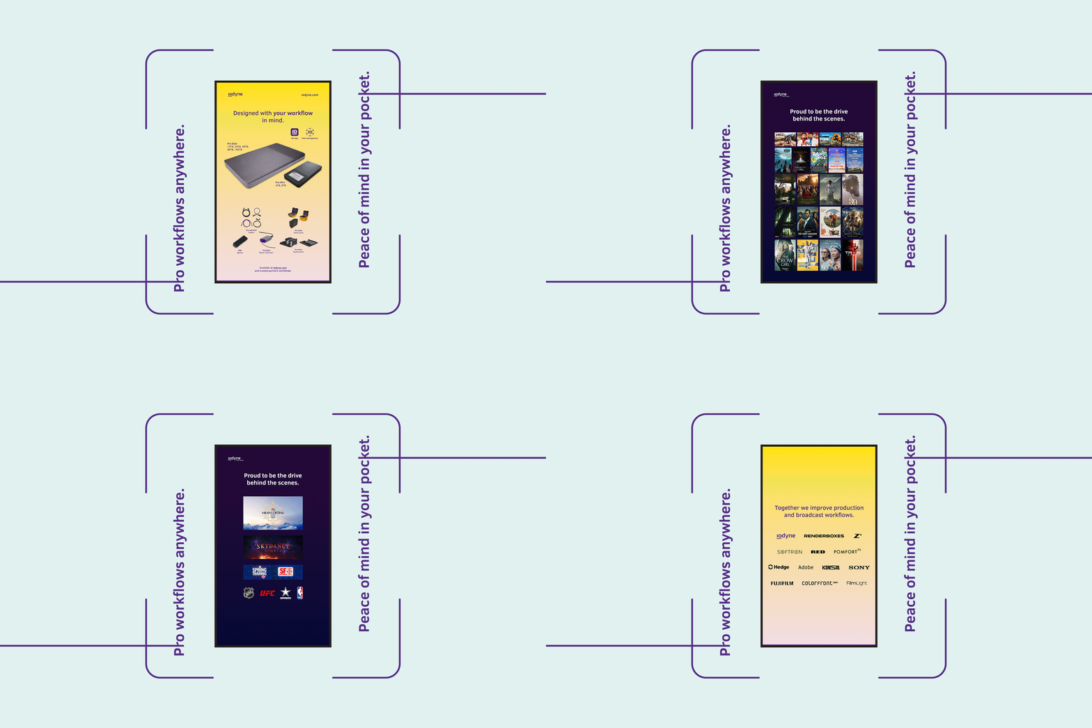
I extended the visual direction across a wide range of applications, from iconography, one-pagers, product graphics, and social ads to trade show environments and print collateral. For iodyne’s booth with blitz micro, I also developed a co-branded visual approach that brought both identities together within a single, cohesive environment. The goal was to create consistency while keeping the system flexible enough to adapt across formats, audiences, and brand partnerships.
Visual Clarity
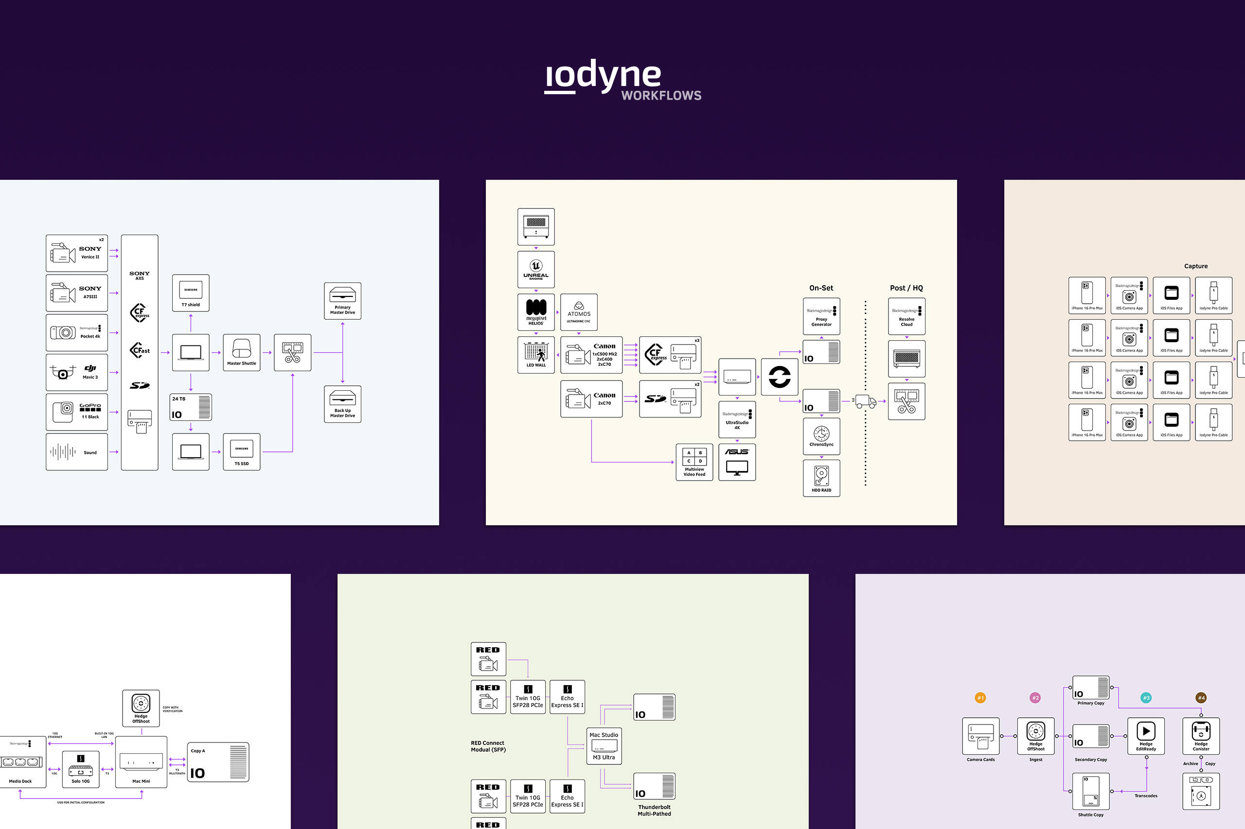
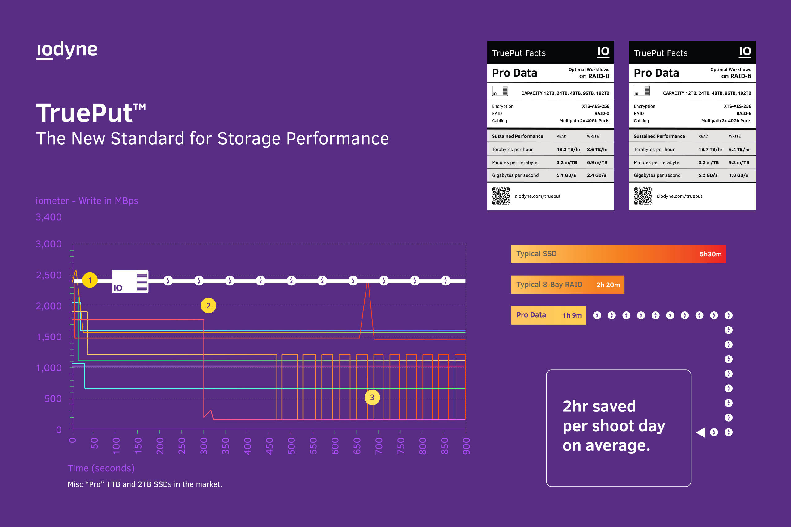
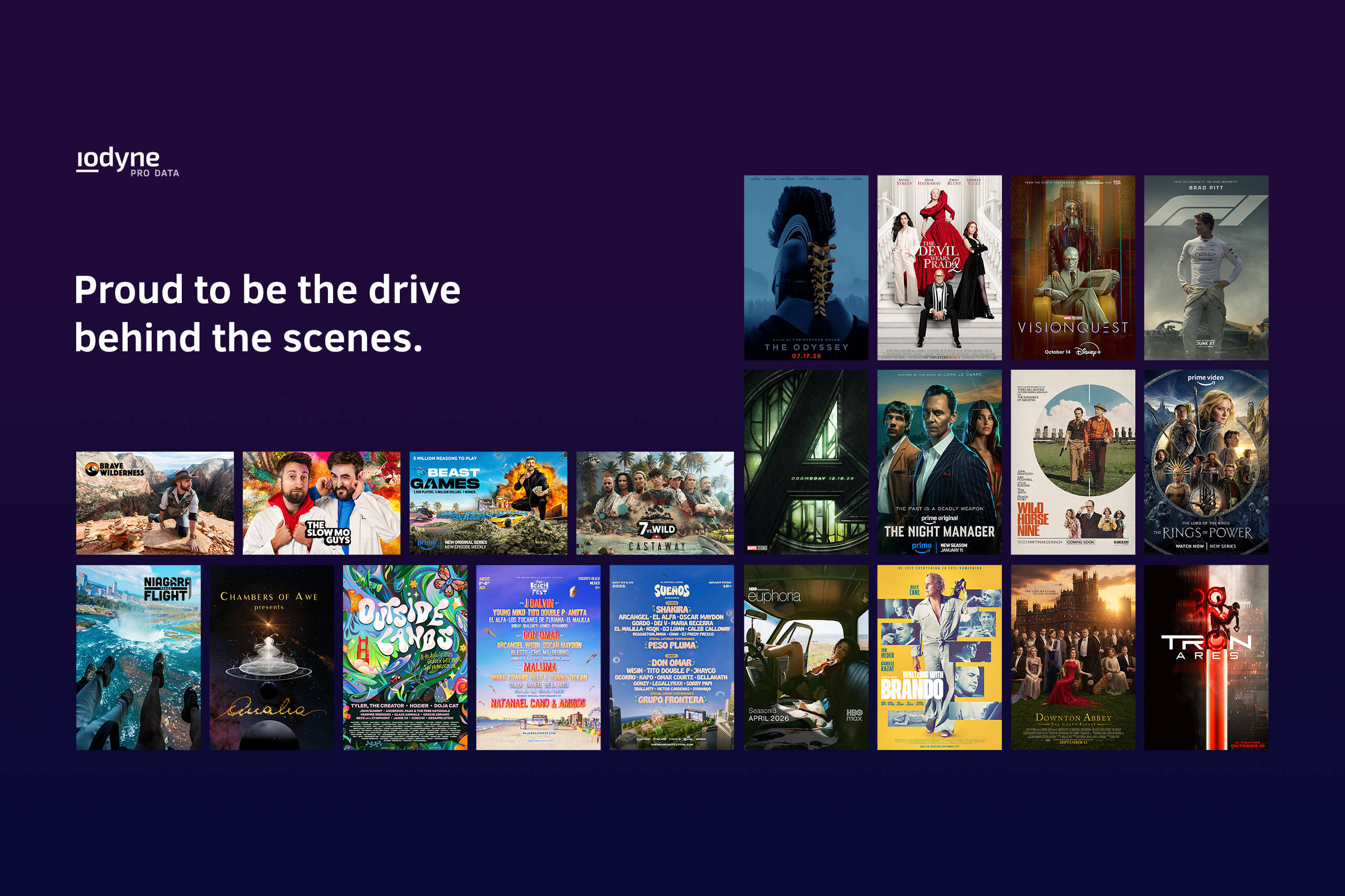
As the system evolved, it also needed to make complex workflows easier to understand. Product diagrams, performance graphics, feature comparisons, and supporting materials were designed to organize dense information into clear visual narratives while maintaining the personality and recognizability of the iodyne brand.